Throwback Thursday: Vintage Event Collateral Exhibition Posters

EVENT COLLATERAL
Hey hey, it s another Throwback Thursday, and this month, we ve dug through the Library of Congress archives for some gorgeous retro promotional exhibit posters, some from as far back as 1878 all the way up to the mid 1940 s. We think you ll love these as much as we do.
1878 Balloon Rides
This poster advertises the bird s eye view from the basket of a balloon at the 1878 World Fair in Paris.

1895 Lithography Centennial
A French exhibition celebrating the 100-year anniversary of the invention of lithography.

1919 Canadian Victory!
As WWI ground to a close, Canada celebrated their win with a victory fair that was uncommonly picturesque, inspiring and colorful .

1939 Worlds Fair
Holy pre-internet logistical nightmare, Batman! Look at this doozy: event planners for the 1939 New York World Fair had to round up 10,000 people willing to open up their homes to expo visitors.

1939 Police & Firemen
Another one from 1939, the Chicago, IL Police and Firemen Exhibit.

1940 Sioux City Camera Club
Wouldn t you love to see those photographs? The Sioux City Camera Club held their 3rd annual exhibition right at the start of WWII. And wouldn t you know it? The SCCC is still around today.

Yet Another Beautiful Conference Branding Roundup for 2015
EVENT COLLATERAL
We ve said it before, and we ll say it again: great conference branding and collateral is more than just something nice to look at . It inspires trust and pride in your conference, gives the event a bit of gravitas, encourages attendees to share their participation, and if done well over a series of events, maintains event continuity (Ted Talks is a great example of continuity in event branding). We ve recently come across another five examples of event branding done right, and it s inspired another post, cuz hey, can we really ever get enough pretty, inspiring things?
SPP Conference

Look at that modernism go. This gorgeous collateral set for the S/P/P (sztuka / polityka / pieni?dze Art / Politics / Money) Conference, designed in collaboration with four creatives, is highlighter-inspired with both structured solids and hand-drawn elements in neon yellow, as if selections were being made and circled on the fly.
Brooklyn Beta 2014

Because Brooklyn Beta is an event for creatives, the two core designers developed a brand based around a black and white line art mural that was colored in and added to by over 800 attendees during the conference. Elements from the mural, which was inspired by 60 s pop art, were added to all event collateral, including the website and mobile app.
Tallinn Music Week 2014

Starting with the idea that new, undiscovered music is like some rare animal, the design is built around a tropical plant visual, created by young painter Eleriin Ello. Somewhat unexpected pink colour and distinctive typography complete the identity, which was applied to a wide range of materials. We re digging the fashion-jungle theme.
Natur Conference 2015

Another monotone-and-neon brand created by San Fransisco-based Claudia Sofia Llaguno. The full set of designs includes large-scale print collateral, website concept, shirts, and more.
Brand New Conference 2014

Ooh, meta: a branded conference about branding. Skillfully made by UnderConsideration out of Austin, who says, Because we are always obsessing about 1984 the year, not the dystopian novel one day our thoughts led us to the origins of the Mac, the venerable tool that allows most of us to make a living. This led to thinking about Susan Kare and her original family of fonts for the deliciously low resolution interface of the original Mac Operating System. Short of a dozen bitmap fonts, all were named after the world s greatest cities: New York, Athens, San Francisco, Monaco, among others. And, yes, Chicago [where the conference was based].
Better Conference Badges: Best Practices for Usability
EVENT COLLATERAL
There s a lot of chit-chat about website usability online today usability essentially meaning best practices for smooth usage by the largest number of people . But websites and applications aren t the only places the principles of usability are important. We stumbled across a super interesting post by Mike Davidson, head of design at Twitter, discussing some of his thoughts on the usability of conference name badge design. Mike isn t alone in this assessment the Wall Street Journal published a 2013 article about badge snobs conference name tag aficionados that sneer at Microsoft Word-produced name badges . This sent us down a rabbit hole of nametag best practice articles, and we ve collected some expert opinions on which little details matter when you re designing badges for your next conference.
Badge size: bigger is better
Mike notes that at the conference, he couldn t read anyone s names on a card size as mall as 2 3. Make the card at least 4 6, he says, for optimum readability. But readability isn t the only reason: in the WSJ piece, a badge manufacture is quoted as saying that big badges make people feel like a rockstar .
Say my name, say my name
The S.O.B. treats the conference badge like a highway sign, complete with a typeface modeled from U.S. highway signs: Interstate. Highway signs are designed to be read from as far away as possible and always present the most important information biggest and boldest. The S.O.B. allows you not only to minimize the awkward glances down while you re talking to someone whose name you don t remember, but also makes spotting people across the room a lot easier. The typical conference badge loses its readability at about 10 feet but from my own crack-testing, the S.O.B. appears readable from up to 30 feet away.

Use readable font sizes and families
Scott McKain, designer and badge connoisseur, says badges should detail the attendee s first name in at least 36-point type, which is a half-inch tall, followed below in 24-point type by full name, title, company, city and state. He also prefers serif fonts because they are easier to read from a distance. He likes ribbon cloth lanyards because, he says, they feel rich.
Protip
In his article, Mike also provides a link to an Illustrator file for usability-optimized name tags go get it!
Graphic Design Inspiration for Event Planners: 6 Gorgeous Printed Menu Designs
EVENT COLLATERAL
So, we just realized what a ridiculous treasure trove of event management creative lovliness Behance is. Brace for insane influx of blog posts about event design and signage. What caught our eye initially was a series of nice banquet menus, cuz event branding is so rarely done well, and it really is in the details, isn t it? And then we realized that there s no reason that event menus can t be as pretty as restaurant menus, and we started looking for inspiration in restaurant branding hoo boy.

The Foodie Dinner Menu

Anisa and Michele Wedding, Georgia Smiraglia

Casa Virginia Menu, Savvy Studio

Tamarindo Menu Design, La Tortilleria

Kinoya Menu, Veronique LaFortune

Microbrewery Menu, Jessica Fecteau
Holy Creativity, Batman: Seven Incredible Event Invitation Designs

EVENT COLLATERAL
We scoured the web for the best event invitation design around.

Teepee Invitation
Every element of this letterpress wedding invitation, designed by Device Creative, is killer: the copy, the idea, the whole thing. Event planner Lisa Vorce wanted a custom invitation that would create conversation and excitement about her clients upcoming Native American-inspired wedding in the desert of Arizona. Drawing from those influences, we designed the form and function of a small teepee, complete with skewers as support beams.

Woodland Lettering Invitation
Created by Portland designer Ian Collins, this beautiful laser cut invitation is designed to mimic a rough-hewn naturalist field guide.

Paper-Vinyl Invitation
The Distillery is an Australian creative studio that hosts live music and art events on premises after hours. An event backed by a design team? No wonder.

Foldable 3D Invitation
This pop-open 3D invitation designed by Florida s Xavier Correa ships flat, but folds out into a four-sided cube. Very fitting for an event named The Art of Transformation .

There s only one thing to say about Italian design studio Happycentro s approach to creating invitations for the opening of a Louis Vitton store in Japan: Nailed it! We ve been asked to design and produce the invitation card for LV store opening in Osaka. The starting idea was a paper object designed by us; its shape, expression of perpetual precision and pureness of the origami world, we wanted to meet with our intimate passion for special printing techniques.

Stitched Invitation
This invitation for the GOMA welcome party succeeds where so much collateral fails: by making it warm, welcoming and above all, personal.

Artsy-pants Invitation
If I can t read it, it doesn t exist . Nice. UK design student Jurate Gacionyte says, Interactive invitation for a Gagosian group show exhibiting artists who work with words as their main medium. The invitation exists both in print and digital form. Completed at School of Visual Arts under the teaching of Luke Hayman and John Fulbrook III.
Best Event Branding & Collateral: a June Roundup
EVENT COLLATERAL
First impressions are kind of a big deal, and event branding counts as a first impression. The beauty and usefulness of programs, maps, badges all the pieces of detritus that attendees are handed the minute they walk in the door constitute a collective statement of purpose and intention by the organizers. We love ogling killer examples of event branding, because we know we re not just looking at pretty artwork, we re looking at a dedication to detail. Here s a tip of the hat to four events and designers that really nailed it.

Now Happenings Festival
Designed by Rocio Fernandez, the Argentinian NOW Happenings festival collateral tacks down the tone of the event instantly: avant and highly artistic, an event for creatives and thinkers.

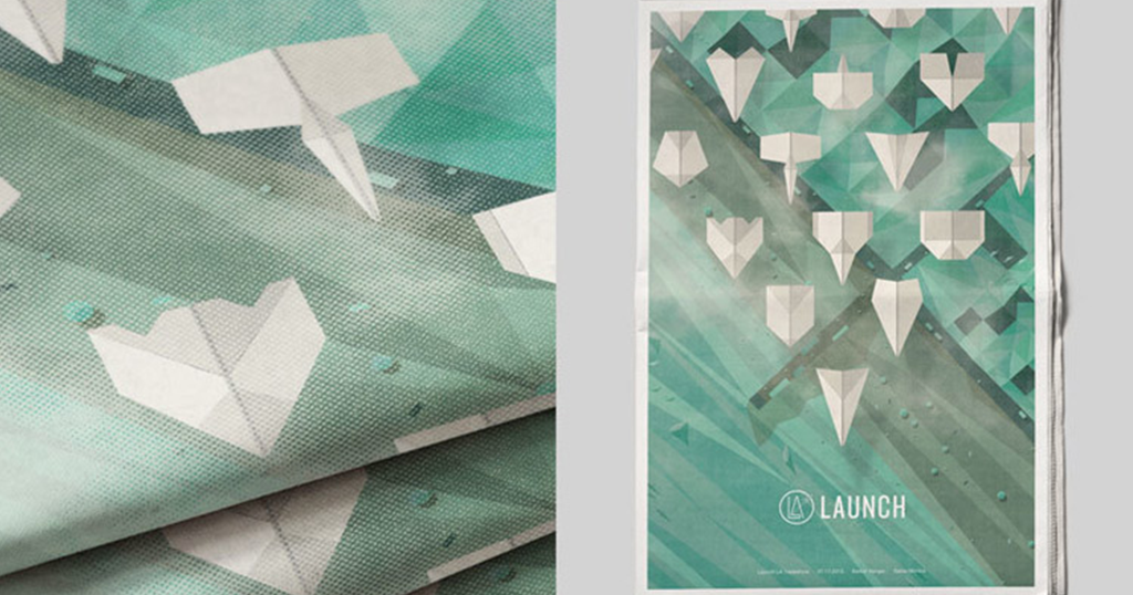
Launch Tradeshow
The Launch Tradeshow collateral set by San Diego s Wedge and Lever, say Organizers of an all-new, California-based lifestyle apparel Trade show contracted us to create a complete identity that would give the Launch Trade show a refined look and feel for its debut. And that they did, with a fresh, beachy theme.

Yay Festival
The Yay Festival is all about the thrum of raw creativity, an energy reflected in the primordial riot of jungle colors and driving brush strokes of their palette and font. Created by Snask from Stockholm, Sweden.

British Independent Film Festival
From the creator, Sam Lane: the idea was to create something innovative that would grab attention and connect with the British Public instantly in order to promote the Festival and Independent Film in Great Britain. This was achieved through the use of a bold colour scheme along with a copy-led campaign that has a very tounge-in-cheek British approach to it.
Fuck Yes, Festival Artwork: More Pretty Event Collateral

EVENT COLLATERAL
Every six months or so we hand-pick the loveliest examples of large-scale event branding from some of the most talented designers and agencies in the world. This time around, we re focusing on the festival circuit.

Tallinn Music Week 2015
What the hell is going on in Estonia? There s a bunch of lovely collateral coming out that place. I guess that s not so weird, though. The country is floating somewhere in between Germany and Scandinavia. They probably teach toddlers Swiss design techniques at gunpoint. Anyway, this great collateral set was created by Aku Studio, who approached the project from a multidisciplinary perspective, using wood cut-outs, photography, and digital design together to create each piece.

Eye La Festival
Sergi Delgado specializes in eye-melting designs. Asked to imagine a mural for Barcelona s La Festival, Sergi created a 250cmx250cm image that represents a new look at the world of wine. A fresh look in order to bring freshness to a sector that at first glance may seem complex, but seen [up close], [is as] friendly and fun as the drops that make up this eye.

Panama Plus Festival
Panama Plus is a yearly festival focusing on alternative culture, particularly via music, prose and cinematography. This year s branding, created by Moby Digg out of Munich, uses color to underscore the festival s vibrant spirit.

Spring Festival Poster Series
Hello, France. This is the kind of cohesive branding you get when your festival sticks with a single agency over the years, and that agency knows what they re doing. For 4 years, we ve been eating poppies ! And we do it with a great pleasure each new season. Since its creation 20 years ago, the poppy has become the harbinger of the Printemps de P rouges ( Spring of P rouges ), an eclectic music festival. Originally coming from an old partnership with the flower by Kenzo fragrance, the poppy stayed and blossomed year after year. Since 2012, we ve been paper gardeners : a paper fruit salad in 2014, a teeming jungle in 2015 And for the 20th anniversary of the Festival in 2016, we imagined an explosive gift package!


WOW Awards Asia
We couldn t decide on a single picture here, because it s not really the visual designs from the 2015 WOW Awards that knock this project by Zaina Engineer out of the park, lovely though they are, but rather the progression of the conceptual execution. Listen to this noise:
The WOW Awards were instituted by EVENT FAQs Media in 2008 to recognize excellence in events and experiential marketing. Over 6 editions, the platform has grown to become a celebration of innovation, evolution and unique initiatives beyond the awards themselves. The concept emerged from an exercise of visualizing the various countries as pieces of lego or building blocks that came together to form the entire Asian sub-continent. Using the visual outcome of this exercise I could build a dynamic grid on which the identity was based.

Present Future Film Festival
Au Chon Hin and Chon Hong Lao collaborated on this eye-vibrating modernist beauty for Japan s Present Future Film Festival.

Spoken Word Festival
The awesome artistic brains over at Anekdote Studio in Denmark created this street-arty, eyeball-nabbing promo series.

Flow
Flow is a musical initiative of DJ Franky Rizardo that started in 2013 as a weekly radio show on SLAM!FM. The initiative has now evolved into a musical movement, with a number of stage hostings on prestigious festivals both in The Netherlands as well as abroad, like Dance Valley, Free Your Mind, Summer Festival, Amsterdam Dance Event and so on.

LEdition Festival
A nod to Avant Post for this one.
Design Thinking for Event Producers: Takeaways from the Adobe XD Design Week 2016 Branding

EVENT COLLATERAL, EVENT DESIGN
If anyone was gonna knock their event branding out of the park, it was gonna be the people who invented Photoshop. But the Adobe XD Design Week branding is a special case of above and beyond.

What is XD Design Week?
The Adobe XD Group is a global design organization responsible for the user experience of most of Adobe s products. Once a year or so, we gather all of our designers, researchers, engineers, and other team members together in San Francisco for a week-long event where we share our work, build our relationships, and plan for the next year.
Crafted by rock star designers Anny Chen and Shawn Cheris, the branding for this event isn t just an example of pretty colors well-worked. This is design thinking at its finest: a rock-solid core concept in the case, the event theme supported by visuals that are both appropriate to that theme and lovely to look upon. Yeah, yeah, Adobe s got one up on the rest of us, in the sense that they have access to some of the best visual artists in the world. But it isn t just artistic skill that carried this branding forward: it was the strategic creative process that underpins the art. So how do we get a little closer to achieving similarly beautiful results in our own events? Well, we learn to think like a designer.
Isolate the Core Concept
Bad design says, Ooh, these color are pretty. Good design says, What are we trying to communicate? If your event isn t centered around a core concept, you re hamstrung right out of the gate. The theme for this year s XD Design Week was convergence , and that was the anchoring idea from which the rest of the festival flowed.
Decide on Means of Visual Expression
Time to dig deeper. We ve got a concept. Now, how are we going to choose to express it?
We explored the ways in which the idea of convergence could be expressed visually forms literally converging on the page, shapes being overlaid on top of one another, and juxtaposition of subject matter (e.g. human versus machine). As we delved deeper, we became more interested in the notion of the Venn diagram, and exploring what happens in the areas where two objects intersect and create a new third space.

Exploring the concept of convergence
Build a Visual System
Festival collateral is extremely diverse, and the imagery you settle on will have to extend across multiple mediums. Your system should be cohesive, meaning that all the parts look like they go together. It should be scalable, meaning that a conference badge and a t-shirt and a stage backdrop and a website can be designed under the guidelines of the system without breaking the system. It should be a little flexible, because life throws curveballs sometimes. How d Adobe do it?
We chose the circle as the consistent, anchoring element with which other shapes would converge on the page. The circle can embody multiple metaphors a lens, a different world, or a unifed whole. We also explored typographic treatments that would integrate well with the visual system. We chose Futura PT (Heavy 700) for its clean, geometric lines, and played with slicing the type along the axis of when two shapes intersected. The color palette and use of gradients were a direct nod to the Adobe XD brand.
Oh, right, and it should be on brand, if at all possible.
Apply holistically
Creating a single piece of collateral at a time, printing it, putting it into use, and then creating the next piece leaves the door open for a scattered and incoherent brand. Unfortunately, due to time constraints and logistics, that s usually what happens. Yes, deadlines are looming. Yes, you need the invitations first, and then posters later, and the speaker schedule booklets last of all. But best case scenario, your event design gets done all at once. At the very least, if you can t have everything designed at the same time, it s important to sketch out a design outline of each piece as a general roadmap so you don t go off course.


Wanna see more stuff from Adobe XD Design Week? Check out the project on Behance.
Top 5 New Gadgets and Technologies We re Excited For As Event Managers
BACKSTAGE, EVENT COLLATERAL, EVENT INDUSTRY, EVENT PRODUCTION TECHNOLOGY, EXPERIENTIAL, MOBILE MEDIA
Earlier this year, Las Vegas played host to the largest tech conference of its kind, the Consumer Electronics Show 2018, or CES 2018 for short. The event showcases technology and cool gadgets, both real and conceptual, entering into the consumer realm. Here at Decibel Management, we re also excited to embrace (and play with) new technology and see how we can implement it into the world of event management. We paid close attention to the news coming out of CES this year as well as other tech markets and here are some items we are looking forward to seeing change the events game.
1. Samsung s The Wall Television
Come on. This is an easy one. A 146-inch micro-LED screen that is adaptive to its surroundings and has nearly endless customization features? Yes please. The Wall allows you to change the size and shape of the display, making customization of visuals and presentation limited only to your imagination. It can also mimic the area it is mounted to, allowing it to disappear from view or allow for more focused areas within the screen. Visuals are a fantastic way to gain engagement and attention at events and The Wall has the size for both main stage focus and the discreetness for professional and intimate settings. Price tag: don t-care-we-want-one USD.

2. Laptop/Tablet Combo Computers
Going to be honest. We don t think combo computers is the official name for these devices, but we liked the way it sounded. Essentially these are laptops that can convert and fold over to function as a touchscreen tablet. While this technology has been around for a few years, it is only now actually being perfected and made to be less clunky. Take Dell s XPS 13 2-in-1 for example. It has a sleek design, is responsive and has great battery life. As event managers we are running around, like constantly. Being able to work on the go, while standing, lying down or trapped in a shipping container is essential and the 2-in-1 technology is making that easier. Now if only Apple would get on board.
3. Projection Phones
The headline says it all. These are phones that can project videos, pictures and media onto any surface. Again, small projection devices have existed for a few years but they are just now starting to live up to expectations. Look at the Movi Phone unveiled at CES 2018. It s an Android smartphone that can project in beautiful 720p. Granted that s no 1080p, but come on it s literally shooting out of the back of your phone. As event managers, being on the road and having to respond quickly comes with the territory. Projection phones allow giving on the fly presentations or adding quick visuals to a space easy and relatively affordable.

4. Augmented & Virtual Reality Technology
Augmented and virtual reality is on the rise in 2018 (or at least Steven Spielberg hopes it is) and has the potential to have a significant effect on the events industry. For the first time ever you don t actually need to attend an event in order to be there. Hell, there doesn t even need to be an actual event space anymore. Just strap on your virtual reality gear and suddenly you re at the Bellagio for your company s sales conference. The best part is that the equipment for this technology is pretty affordable too, with many AR and VR devices only costing a couple hundred dollars. Don t get us wrong, we believe there is no substitute for true in-person engagement, but we are excited to see how this new technology will change the industry. At the very least it could make the conference calls between our D.C. and NC offices a little more entertaining

5. Wireless Charging
We know. Charging your device does not sound as sexy as a 146-inch high-def modular TV from the gods (please someone buy us The Wall ) but it s a great example of a subtle technology that will change our lives as event managers. Companies like Powercast and Energous have developed technology that allows your devices to be charged wirelessly .THROUGH THE AIR. Imagine never having to be tethered to a wall again while
you re late for a presentation but you need to send out that one last email so you don t get fired and oh God your kid s school is calling now, damnit what did Billy do this time. Well, this scenario could soon be a thing of the past, well at least the being tethered part, Billy is still a monster. At Decibel, we are seriously excited at the prospect of an entire event space being charged. All the attendees no longer having to fight over the two outlets in the venue, everyone happily snapping pictures, sending emails etc. while throwing caution to the wind over their power bar levels. Ahh.
Honorable Mention: Self Delivering Pizza Trucks
It s a thing now and we don t think this requires an explanation. Just hurry up and get to Washington, D.C. already.
Audience Engagement: A Trend To Watch Literally.
BACKSTAGE, EVENT COLLATERAL, EVENT INDUSTRY, EVENT PRODUCTION TECHNOLOGY, EXPERIENTIAL, MOBILE MEDIA
While 2018 may only be in its infancy, we have already seen some amazing productions take place. The first few months of this year have played host to some of the largest global events in the industry. One trend we here at Decibel Management are seeing consistently is how planners have up d the game for audience engagement, but not just for those in attendance, but rather those viewing at home.
The Super Bowl:
Polls show that 92{04d9822e7d95da125d508d8e1efbcf2edc79acd8aec1f0bbdcbd6a6f684f9bb3} of Super Bowl views can t even name the two teams playing in the game (not a real stat). But let s face it, most of us just watch for the commercials and to have an excuse to gorge yourself on various batter & sauce covered foods. That s why the people behind the Super Bowl are always looking for ways to have viewers turn the sound back up on their TV once the commercials are over. This past year marked Super Bowl LII (that s 52 for those of us who forgot our Freshman year Western Civ lectures) and the producers brought in a big hitter for the halftime show. None other than JT himself, Justin Timberlake. While many viewers may have watched the half-time show in hopes of another wardrobe malfunction , unfortunately, Janet Jackson s invite was lost in the mail. However, the production teams came up other tactics to make viewers feel like they were right there in the mix. Much of the halftime show was shot at ground level in single shot format, the camera moving around the field with Timberlake, resulting in a viewing experience designed to make you feel like you were in the stadium walking alongside. The icing on the cake came towards the end of the performance when Timberlake entered the stadium s seating area to dance and sing with those in attendance, thus helping to further remove the wall between performer and audience. We even got a new meme out of it! #selfiekid

The 2018 Winter Olympics In Pyeongchang:
The Olympics are notoriously difficult for producers. Whether it s the time differences (this year saw a nearly 12-hour gap for the US East Coast and Pyeongchang) or viewers lack of interest in hurling a rock down an ice rink and sweeping it along. There are many hurdles to overcome when coming up with strategies for this event. NBC had an interesting tactic for this year s games Quantity. NBC live-streamed a record-breaking 1,800+ hours of coverage, including every single event, over 100 medal events and 24/7 news and highlights, almost doubling their coverage from the 2014 Winter Olympics in Sochi. Viewers had more access and viewing options to this global event than ever before, making the Olympics feel more accessible and approachable. So sorry to all the chumps who bought round-trip flights to South Korea, chances are the fans at home got way more Olympic intake than those in attendance. Which is great news if you love shooting guns while cross-country skiing.

The Academy Awards:
The Oscars have seen declining viewership in recent years. The 2018 Academy Awards saw the lowest ratings ever. Yep. EVER. It was the least watched Oscars broadcast since their inception, down a whopping 19{04d9822e7d95da125d508d8e1efbcf2edc79acd8aec1f0bbdcbd6a6f684f9bb3} from just last year. I mean, who doesn t love a four hour ceremony of celebrities thanking themselves. However, while viewership may be down amongst this event that many people see as being out of touch or unrelatable, it s not for lack of trying. This year s awards included a segment where host Jimmy Kimmel surprised a theatre full of unsuspecting movie-goers with a who s who of celebrities handing out snacks and talking with the audience. You see, THEY RE JUST LIKE US! The Oscars team also attempted to poke fun at themselves a bit, by having a jet-ski giveaway for the recipient with the shortest acceptance speech. While elements like these work to remove the barrier between Hollywood and the audience, it s clear the Academy Award producers face an uphill battle if they want to get back to where the ratings used to be. Our vote: host the next ceremony at the Super Bowl halftime. It ll be a win-win.

With all this emphasis on audience engagement for those not in attendance, we are interested to see how this could have an effect on live event production moving forward. New tech and production techniques are making it easier and more cost effective to have offsite attendees. As an event management team, we believe there is no substitute for in-person impressions, but this is definitely a trend we ll be tracking and embracing.